Finance, Investments
Your Pension, On Your Terms
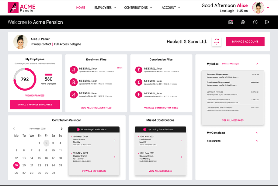
This pension provider spent 20 years building a foundation of financial security for our members. But while our pension policies are rock-solid, their digital gateway was becoming a relic.
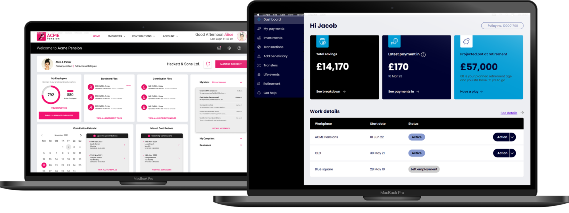
The existing portal—responsible for managing retirement dates, fund allocations, and claims—was a bottleneck. It was built for the legacy systems of the past, not the mobile-first, self-service expectations of today. The result? A confusing experience that kept members at arm's length from their own retirement goals.
But while the engine under the hood remained powerful, the user experience had stalled. Visually and structurally, the platform felt like a relic from a decade ago. It had grown organically rather than strategically, resulting in a fractured experience where:
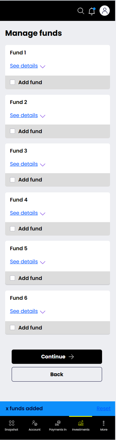
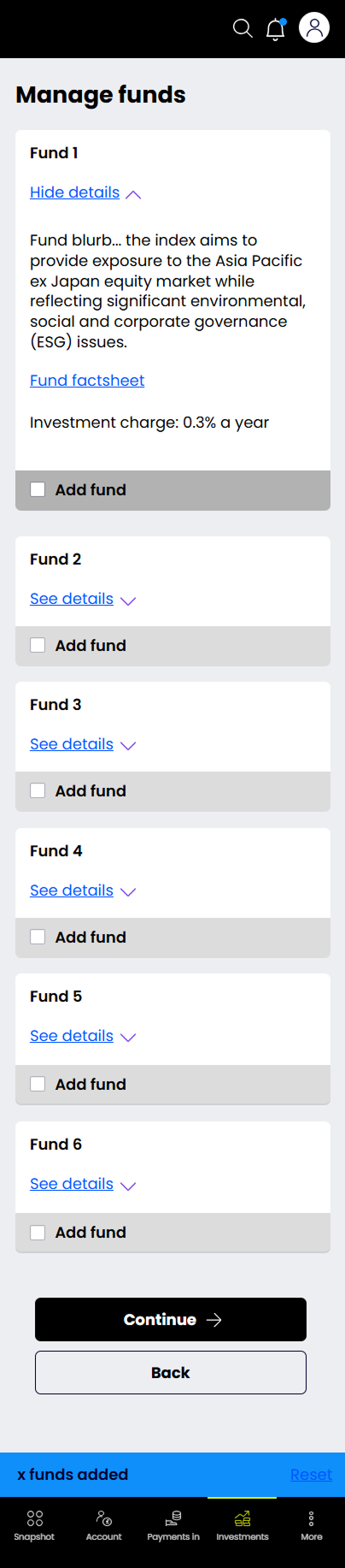
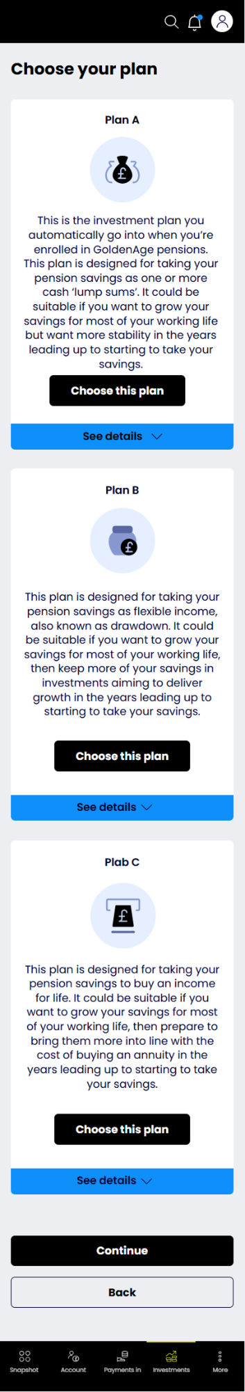
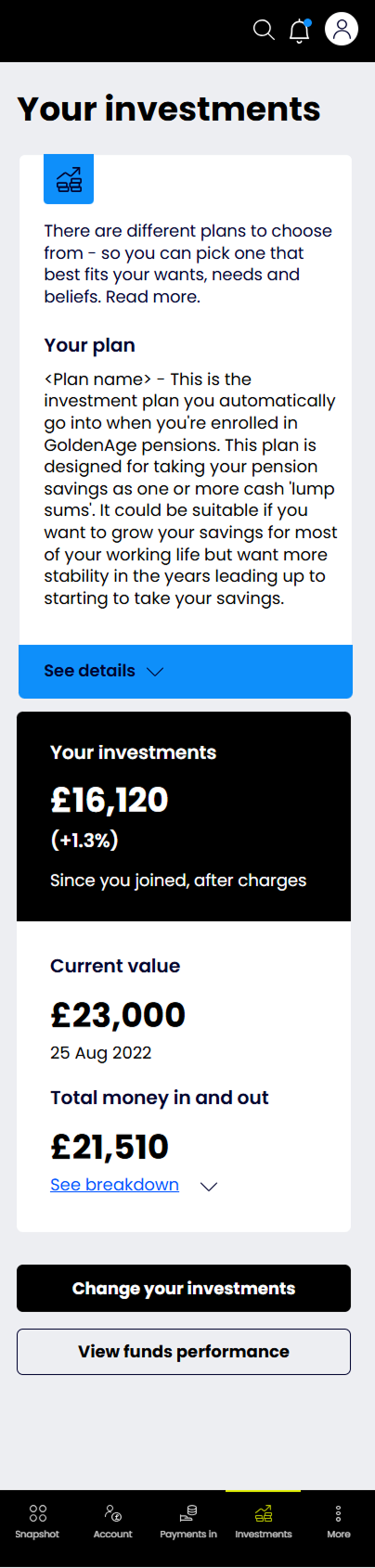
Navigation was buried in endless, confusing nested lists.
Data density overwhelmed the user, with tables repurposed across modules that lacked visual polish or hierarchy.
Core interfaces—including the map, terminal pages, and dashboard—were bloated, making critical in
formation difficult to scan during high-pressure situations.
The visual clutter created a steep learning curve, making onboarding new users a significant hurdle.
3 workshops to earn clients' trust
We kick off with a all day workshop, a low-risk way for clients to see how we work.
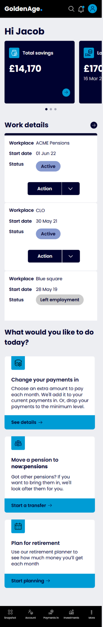
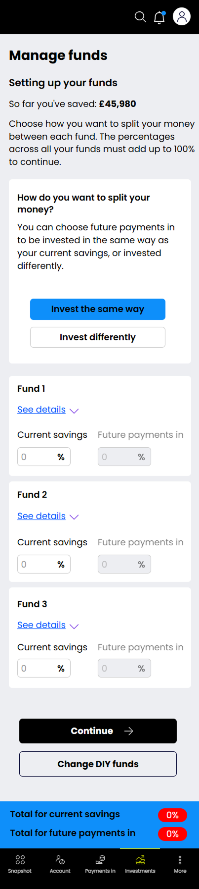
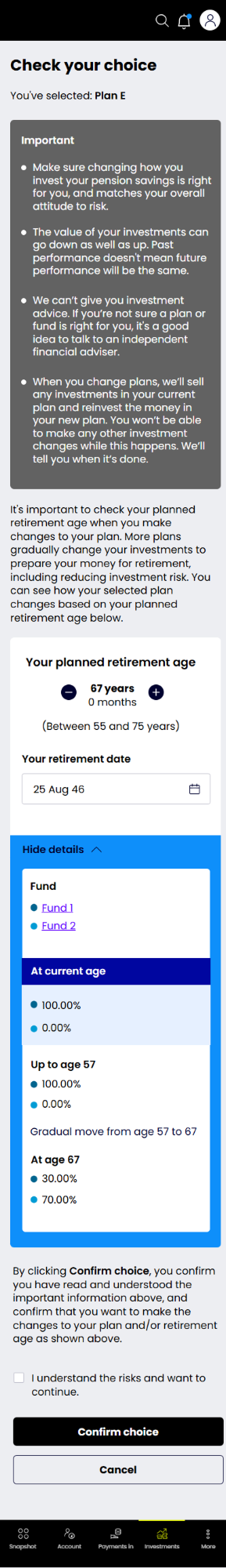
The trial was simple on paper: redesign the existing Home page without changing functionality or structure.
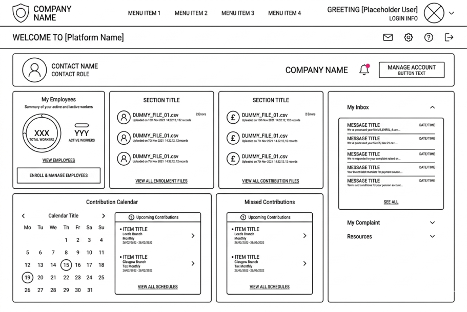
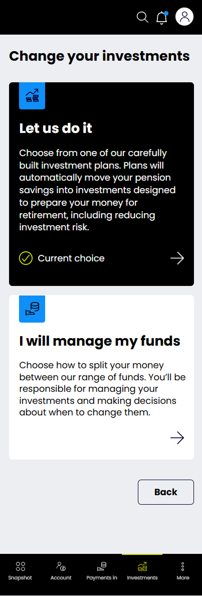
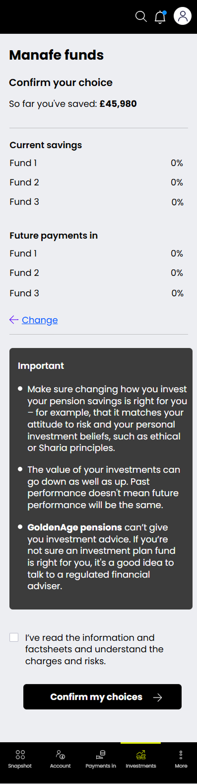
Our focus was clear: modernize without sacrificing usability. We achieved this by streamlining page hierarchies, decluttering interfaces, and refining how users interact with complex data like maps and tables.
Through high-fidelity homepage variations, we demonstrated how a unified design system could transform the platform’s usability and set a new standard for future development.
Key Improvements Made:
"Maintaining layout familiarity" → Rephrased to emphasize preserving or respecting the existing user workflow, which is crucial for complex tools.
"Applying visual structure" → Refined to "streamlining page hierarchies" or "standardizing," which sounds more professional.
"Making... easier to read and reuse" → Upgraded to "optimizing data visualization" or "refining how users interact with complex data," which highlights your UX expertise.
"Proving the concept" → Strengthened to "validating our approach" or "demonstrating viability."
That short trial convinced the client: by redesigning just one component, we demonstrated how a small change could streamline development and bring visual consistency across the entire product.
Here is what we did:
- Rebuilt the Employer payroll processing first - being the crux of the overall pension processing, it was a crucial part in the machinery to be addressed and streamlined first.
- Build logic for legacy members to migrate - Pension client had over 3Million pensioners which needed to move to new system without re-registeration.
- Create a new brand identity which resonates with clients' business values
- Clustering redesigned.